If your Android home screen has turned into a wall of icons you barely tap, Niagara Launcher is the one I keep pointing friends toward. It throws out the usual grid and replaces it with a single alphabetical list you scroll with your thumb. Within about ten minutes the phone feels quieter. Here is how to set it up, what actually matters day to day, what costs money, and where it falls short.
Installing is the easy part. Get Niagara Launcher (bitpit.launcher) from the Play Store, open it once, then press the home button. Android will ask which launcher to use and whether to make it the default. Pick Niagara, confirm, and the home screen changes right away. Nothing gets deleted, so if you hate it you can go back through Settings, then Apps, then Default apps.
The first launch runs a short walkthrough that teaches the one gesture everything depends on: slide your thumb up and down the right edge to run through the alphabet, then tap a letter to jump to those apps. Do the tutorial. It takes a minute and the whole launcher rests on that motion. After that, long press an empty spot to open Niagara Settings and pin your favourite apps to the top. Keep it to the handful you open every day.
One setting worth flipping early lives under Settings, then Look, then Dim wallpaper. It darkens the background a touch so the text labels read more clearly. Worth knowing: Niagara uses a subtle tint here, not a blur, and that is on purpose. The point is to push the wallpaper back without smearing it.
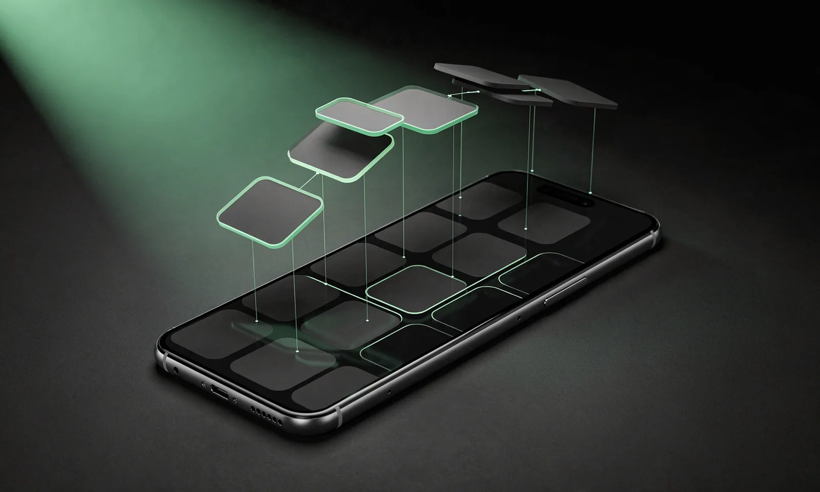
The whole thing is built around one vertical list, sorted A to Z, with that alphabet scroller down the right side. No paging, no folders full of icons you forgot about. It is genuinely one-handed, which still surprises me on a big phone.
Notifications fold into the same list. When a message lands, the app expands inline so you can read it, reply, or clear it without opening anything. That alone cut down how often I tap into apps just to check something. There is a tidy clock and date up top, and an optional media widget that shows whatever is playing. All of this is free.
One thing to set straight, because plenty of guides get it wrong: folders are not part of the free, calm-by-default setup. Niagara calls them Pop-Up Folders, and they let you group apps behind a single label that slides out sideways (handy for stashing all your banking apps in one spot). But Pop-Ups sit behind Niagara Pro along with the other pop-up tricks. The free tier gives you the list, your favourites, and inline notifications, not folders. If someone tells you the folders are free, they are looking at old info.
A few habits made the difference for me. Trim your favourites hard. The urge is to pin a dozen apps, but it works best when only your true daily five or six sit up top and the rest wait in the scroll. Anything more and you have just rebuilt a small grid.
Learn two gestures: double-tap to lock the screen, and swipe down to pull notifications. Both live under Gestures in settings, and they save you reaching for buttons or widgets. Pair the launcher with a calm wallpaper and you are most of the way there, since the layout is so spare that the background does the visual work. A soft photo or a plain dark backdrop both look good.
If you like icon packs, Niagara reads them, and a consistent set pulls the look together. Hiding apps you never touch through the app list editor shortens the scroll too. One heads-up so you are not caught out: the finishing tweaks like custom colours and custom fonts are Pro, not free, so do not expect to change those without paying.
Niagara asks for very little. To show inline notifications it needs Notification access, granted through a dedicated Android toggle, and that is the main one most people turn on. It does not ask for contacts or location, which is a real point in its favour. Still, glance at the permission screen yourself before you grant anything.
Now the honest part about money, because the free-versus-paid line matters here. Niagara Pro is mainly a subscription at $13.99 a year (about 12.99 EUR), or you can pay once for a $42.99 Lifetime unlock if you would rather skip the renewal. It is not a simple one-off paid app, whatever older write-ups imply. Pro is what gates Pop-Up Folders, the adaptive app list that learns and reorders your apps, most of the advanced widget placement, the extra gesture actions, and the custom fonts and colours. The free version is still useful on its own: the alphabetical list, favourites, inline notifications, the media widget, and wallpaper dim all work without paying.
The bigger trade-off is layout freedom. You give up the traditional icon grid by design, so if you love arranging apps into spatial clusters or filling screens with large interactive widgets, Niagara will feel tight. Widget support exists but stays deliberately limited.

Niagara is not the only way to calm a home screen. If you want deep control with grids, gestures, and heavy theming, the name everyone used to reach for was Nova Launcher. I would be careful there now. Nova has had no real feature work since mid-2024, it was sold to Instabridge, and a 2026 update bolted on Facebook Ads and Google AdMob tracking code, on top of crash reports on Android 15 (Pixel 9, Galaxy S25). It still installs, but it is the old default in decline rather than a safe recommendation.
For power users the current open-source pick is Lawnchair, whose release line is now at version 15. It runs on Android 15, supports icon packs and custom gestures, builds on the Pixel Launcher, and carries no ads or trackers. That is the Nova replacement most people land on. If you want to go further toward a near text-only phone, Olauncher and Before Launcher are both still on Google Play and lean hard into screen-time discipline, and KISS Launcher takes a search-first angle that some minimalists prefer.
To compare the field properly, our roundup of the best launcher apps for Android lines the main options up side by side, and the wider Android personalization hub has more ideas. Once your layout is set, a tidy clock helps, so see our picks for the best Android clock widgets. And since a spare screen pairs well with fast typing, our SwiftKey versus Gboard comparison is a good next read.
For me the answer is yes if your phone tends to overwhelm you. Niagara keeps a small set of apps and your live notifications within thumb reach and quietly hides the rest. Setup takes minutes, it asks for almost nothing, and the free version covers the basics without nagging you to pay.
It is not for you if you love a busy, widget-heavy desktop, and a few of the nicer touches are locked behind Pro. But if you want a calmer, faster, more deliberate home screen, this is one of the simpler changes you can make on Android in 2026. Give it a week before you decide. The scrolling habit clicks faster than you would expect, and going back to a grid afterward feels noisy.
Mostly. The core launcher is free, including the alphabetical app list, your pinned favourites, and inline notifications, and there are no ads. The extras sit behind Niagara Pro: Pop-Up Folders, the adaptive app list, advanced widget placement, custom fonts and colours, and extra gestures. Pro is $13.99 a year, or a one-time $42.99 Lifetime unlock if you would rather not subscribe. You can run a clean minimalist setup without paying anything.
No. A launcher only changes how your home screen looks and works. Your installed apps, files, and accounts stay put. If you decide Niagara is not for you, switch back to your old launcher through Android Settings under Default apps, and nothing is lost.
It reads popular third-party icon packs, which help unify the look, and it offers a focused set of widgets rather than a full grid. If you lean on lots of large widgets you will find it limited, and the more advanced widget placement is a Pro feature. For a pared-back screen, the free options cover most everyday needs.
It runs light in normal use, since it loads far less on screen than a typical grid launcher and there are no constantly refreshing widget walls to keep alive. Results vary by phone, but most people report no real battery hit.
 Best Launcher Apps for AndroidPersonalization
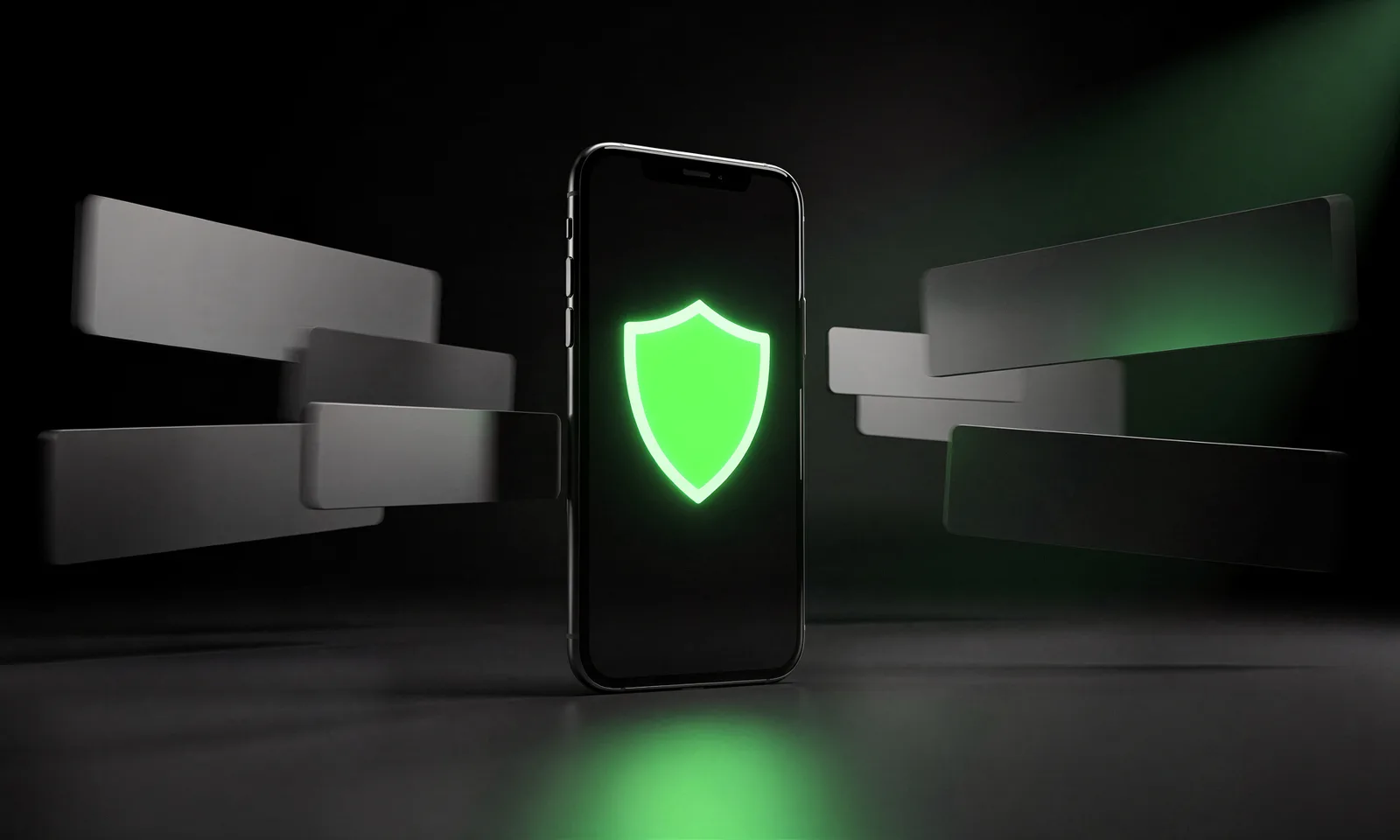 How to Block Ads on Android Without Rooting (2026)Security & Privacy