Updated September 2026 · all six apps now carry their own dated listing figures, and the set sits in one table
Instagram on Android is fine at posting, but it is honestly mediocre at making your photos look their best. So we compared the companion apps people actually recommend, reading each one's Play Store listing and the developer's own documentation. The goal was simple: figure out which Android apps actually move the needle and which just clutter your phone. Here is how to set them up, the features worth your time, and the downsides worth knowing before you install anything.
The good news is that none of this requires anything technical. Every app here lives on the Play Store, so you search the name, tap install, and you are editing within a minute or two. Keep the official Instagram app as the hub and treat everything else as a feeder, editing or planning in the companion app first, then exporting the finished image to post. That split matters more than it sounds, because it lets each tool do the one thing it is good at instead of asking Instagram to be a full editor, a planner, and a publisher all at once.
On first launch most of these tools ask for access to your photos so they can pull in the shot you want to work on. On Android 13 and newer you get the option to grant access to selected photos only. When you open the picker again, the app simply asks for the next batch. A planner or scheduling app will also ask you to connect your Instagram account, which opens a quick login screen and sends you back once you approve. If you run a creator or business account, some planners route this through Facebook because that is where Instagram keeps its publishing permissions, so do not be surprised when the login screen mentions Facebook even though you only care about Instagram.
The one real friction is remembering to save the edited file to your gallery before jumping back to Instagram, since a couple of editors keep your work tucked inside the app until you tap export. Get into the habit of finishing an edit, tapping export or save to device, and only then switching apps. It is also worth turning on the highest export quality in each editor's settings on day one, because several default to a smaller size to save storage, and you will not notice until a post looks soft. Spend five minutes in the settings screen of any new editor before you trust it with a real photo. One more small thing: if you shoot in your phone's camera app and it saves in a newer format like HEIF, a few older editors choke on it, so set your camera to save JPEG if an app refuses to open your shots.
This is where the difference is most obvious. A dedicated photo editor gives you control that Instagram's built in filters simply do not. The tools that count are selective adjustments, the ability to brighten a face without blowing out a bright sky behind it, plus proper curves and white balance for fixing the orange tint you get under indoor lighting. Pulling highlights back and lifting shadows turns a flat phone snap into something that looks deliberate. None of that is hard once you have done it twice, and it is the single biggest jump in quality you can make.
Snapseed is the pick of these. It is made by Google, it is free, and as of 2026 it still carries no ads, no watermark, and no subscription, which is rare. Its selective tool lets you drop a point on a face or a shirt and adjust only that area, and its curves and white balance are as good as anything you pay for. It does open RAW files too, if your phone camera saves them. For years the honest catch was that Google barely touched Snapseed. That is over: its Play listing shows it updated on 3 September 2026, so the app is under active development again.
Adobe Lightroom is the step up if you want your edits to sync and you shoot a lot. The free tier covers exposure, color, curves, and a deep set of presets, and it handles RAW cleanly. The parts most people actually want, like cloud sync across devices, the healing tools for removing a stray object, and selective masking driven by the app picking out the sky or a subject for you, sit behind a subscription: the Lightroom listing puts its in-app purchases at $0.49 to $499.99 per item, read 4 September 2026, which is a band rather than a price. If you only edit on one phone, the free version is plenty.
VSCO is the third pick, and it earns its place on color. Its film style presets are the reason people use it, and the free app gives you a starter set plus basic adjustments. The full preset library and the finer tools come with VSCO membership; its listing puts its in-app purchases at $0.99 to $29.99 per item, read 4 September 2026. If a consistent film look is what you are after, that is money reasonably spent; if you just want to fix exposure, Snapseed does it for nothing.
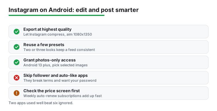
Presets were the other big time saver across all three. Build a couple of your own looks, a warm film tone and a crisp cool one, then apply them across a whole batch so the feed stays consistent without every photo looking identical. Saving your own preset takes one tap in any of these editors once you have an edit you like, and reusing it is the habit that quietly makes a feed look intentional. If you want to go deeper on the editing side, our roundup of the best photo editor apps for Android breaks down which tools handle layers, retouching, and RAW files, and any of them pairs naturally with an Instagram workflow. Our advice is to pick one editor and learn it well rather than installing four and using none of them past the first day.
Selective edits without paying anything
4.5 stars from 1,804,183 reviews · 100,000,000+ installs · free · no in-app purchases · by Google LLC · Contains ads: No · checked 4 September 2026
Google Play listing · 4.5 (1,804,183) · read 4 September 2026
The rare case where the free pick is also the strongest: its listing, read 4 September 2026, shows no in-app purchases at all and no Contains ads label, which almost nothing else in this category can say. Its selective tool drops a control point on a face or a shirt and adjusts only that area, and it opens RAW files. The old complaint that Google had abandoned it no longer holds either: the store shows it updated on 3 September 2026.
RAW work that follows you across devices
4.5 stars from 3,646,915 reviews · 100,000,000+ installs · free to install · in-app purchases $0.49 to $499.99 per item · by Adobe · Contains ads: No · checked 4 September 2026
Google Play listing · 4.5 (3,646,915) · read 4 September 2026
Free to install with no Contains ads label, and the free tier already covers exposure, colour, curves and presets, plus clean RAW handling. What it charges for is what the page above calls the parts most people actually want: cloud sync across devices and the masking that picks out a sky or a subject for you. The listing puts its in-app purchases at $0.49 to $499.99 per item, read 4 September 2026, which is a band rather than a price, so check what your own account is offered.
A consistent film look across a whole feed
3.6 stars from 1,325,793 reviews · 100,000,000+ installs · free to install · in-app purchases $0.99 to $29.99 per item · by VSCO · Contains ads: No · checked 4 September 2026
Google Play listing · 3.6 (1,325,793) · read 4 September 2026
The look people mean when they say a feed is consistent, and the weakest rating in this group at 3.6 stars from 1,325,793 reviews, which is what happens when the free tier is a sampler. Free to install with no Contains ads label; the full preset library sits behind membership, and the listing puts its in-app purchases at $0.99 to $29.99 per item, read 4 September 2026.
Editing is only half the game now that Stories and Reels carry so much reach. A template app is the fastest way to put a Story together: drop the photo into a ready made layout, swap the text, and export a clean frame in under a minute instead of fighting Instagram's fiddly sticker tools. The animated text and tidy typography templates are the most useful ones, because they make a casual post look like someone spent real effort on it.
Canva is the obvious starting point, because its free Story templates are plentiful and you can edit text, swap fonts, and drop in your own photo without paying. It exports a clean 1080 by 1920 frame ready for Stories or Reels covers. Unfold is the other one worth knowing, with a calmer, more editorial set of layouts; it is free to start and unlocks its full template packs through a subscription. Both are on the Play Store and both export at full resolution, which is the part that matters. There are dozens of similar template apps, but a fair number lean hard on ads and push a weekly subscription, so check the price screen before you commit.
The planning apps do the quietest job of the three kinds. Dragging photos around a mock grid to see how the next nine posts sit together is how two clashing colours get caught before they are posted. Plann, which is what the Preview app is called on the store today, is the Android app built for this: plan, lightly edit and arrange the grid from the phone, with a free tier that covers the basics. Later and Planoly are the bigger names if you want true scheduling and auto publishing; both can publish a post automatically at a set time on eligible creator and business accounts, and both have moved largely to paid plans, with Planoly starting around sixteen US dollars a month in 2026 and Later in a similar range. For a personal account, the free preview view alone is usually enough; the paid scheduling is for people running a brand or a side project who post on a calendar.
One honest limit on auto publishing: it only works for image and standard video posts on professional accounts connected through Facebook, and Instagram still does not let third party apps auto publish every format; carousels have long been supported through the official publishing API, but some Reels and sticker features can need a manual nudge. We treated scheduled posting as a reminder system as much as a true autopilot, and that framing kept us from being annoyed when a post needed a final tap.
A finished Story frame in a minute
4.8 stars from 26,836,212 reviews · 500,000,000+ installs · free to install · in-app purchases $1.49 to $300.00 per item · by Canva · Contains ads: No · checked 4 September 2026
Google Play listing · 4.8 (26,836,212) · read 4 September 2026
The best rated app on this page by a distance, 4.8 stars from 26,836,212 reviews across 500,000,000+ installs, read 4 September 2026. Free Story templates are plentiful, text and fonts are editable without paying, and it exports the 1080 by 1920 frame Stories and Reels covers want. Its in-app purchases run $1.49 to $300.00 per item, and the paid tier is where the stock library and brand kits live.
Layouts that do not look like templates
3.8 stars from 175,860 reviews · 10,000,000+ installs · free to install · in-app purchases $0.99 to $99.99 per item · by Squarespace Inc · Contains ads: No · checked 4 September 2026
Google Play listing · 3.8 (175,860) · read 4 September 2026
The quieter alternative to Canva, with a more editorial set of layouts and a smaller audience: 10,000,000+ installs against Canva's 500,000,000+. Free to start, no Contains ads label, and the full template packs unlock through a subscription; the listing puts its in-app purchases at $0.99 to $99.99 per item, read 4 September 2026. Its 3.8 stars from 175,860 reviews is the second weakest score here.
Seeing the next nine posts before you post them
4.5 stars from 11,834 reviews · 1,000,000+ installs · free to install · in-app purchases $0.99 to $329.99 per item · by Linktree · Contains ads: No · checked 4 September 2026
Google Play listing · 4.5 (11,834) · read 4 September 2026
The app this page used to call Preview now lists as Plann: Preview for Instagram, published by Linktree, read 4 September 2026. It is the one built for dragging photos around a mock grid so clashing colours are caught before they are posted. Free to install with no Contains ads label, at 4.5 stars from 11,834 reviews, the smallest review count on this page, with in-app purchases from $0.99 to $329.99 per item.
A few small habits do most of the work. First, always export at the highest quality the editor offers and let Instagram do the compressing, rather than shrinking the file yourself and getting compression twice. Detail survives far better that way. Instagram has been leaning taller since it moved grids to 3 by 4 previews, so the safest export in 2026 is 1080 by 1440 in the 3 by 4 shape, with the older 1080 by 1350 4 by 5 export still accepted and displayed fine.
Second, shoot a touch wider than you need, since the 4 by 5 portrait crop is the most screen friendly size on a phone and you want room to frame it. Portrait fills more of the screen as people scroll than a square does, which is why it tends to hold attention longer. For Stories and Reels, work in the 1080 by 1920 vertical shape, which is 9 by 16, and keep your subject roughly centered so it survives the crop on different phones.
Third, build a small set of go to presets and reuse them, because consistency is what makes a feed look intentional. Two or three looks is plenty; more than that and you are back to every photo looking different. Fourth, when you add a link or text in a Story, keep it clear of the edges where the interface buttons sit. The top strip and the bottom reply bar both eat into your frame, and we learned that the hard way after a few captions got half hidden behind the reply bar. Leave a comfortable margin, roughly a finger's width, top and bottom.
A couple more that paid off: edit in daylight or under a single light source rather than mixing a warm bulb with a cool window, because fixing two color casts at once is a losing battle even with good white balance tools. And keep your originals. Save the edited copy, but do not delete the untouched shot, because you will want to redo an edit later when your taste changes or a new preset comes along. None of this is complicated, but together it is the gap between a feed that looks thrown together and one that looks considered.
Time to be honest about the trade offs. The permissions themselves are usually reasonable. An editor needs photo access, a camera based app needs the camera, and that is mostly it. Be cautious with any free Instagram helper that wants contacts, location, or the ability to post on your behalf without a clear reason. We skipped anything that asked for more than the job required, and you should too. Granting selected photos only on newer Android versions is an easy way to stay tidy, and you can review what you have allowed any time under the app's entry in Android Settings.
The bigger watch out is the third party tools that promise followers, auto likes, or bulk actions. Those frequently break Instagram's terms and can get your account flagged or limited, so we steered clear entirely and recommend you do the same. Most of them also work by taking your Instagram password directly, which hands your login to a stranger, and that alone is reason enough to walk away. If a tool ever asks for your Instagram password rather than sending you to the official login screen, close it.
Free editors and template apps lean on ads and watermarks, with the better features locked behind a subscription, which is a fair model but worth checking before you get attached. Read the price screen, not just the store listing, because the real cost often shows up only when you tap a locked feature. Watch for the subscriptions that auto renew weekly, since those add up fast and are easy to forget. Stick to well known developers with visible reviews and a real privacy policy, and skim the recent one star reviews, which is where billing complaints and broken updates tend to surface first.
If you would rather not juggle several apps, a couple of all in one editors now bundle filters, templates, and basic Story layouts under one roof, which trims your home screen at the cost of some depth. Canva is the closest thing to that, since it covers Story templates, simple photo edits, and grid mockups in one place, though it is weaker than a dedicated editor on fine color work. Instagram's own editing tools have also improved, so for quick everyday posts the built in adjustments and filters are genuinely fine. The companion apps earn their place when you care about a consistent look or you post often.
It is also worth thinking about which social platforms you actually want to invest time in. For a wider tour of apps that respect your screen and your privacy, start with our Social apps for Android hub. If you spend time elsewhere too, our guide to customizable Reddit apps for Android and our look at secure Twitter clients follow the same idea of choosing a better app than the default and making it work for you. Whatever you settle on, two apps used well beat six installed and ignored, and you can always add more once you know what your posting actually needs.
Not strictly, since Instagram's own filters and adjustments are decent for quick posts. But a dedicated editor like the free Snapseed gives you selective brightness, curves, and reusable presets that the app cannot match, and a template tool makes Stories far faster.
We avoid them, and we suggest you do too. Tools that promise followers or perform bulk likes and follows usually break Instagram's terms of service, which can get your account flagged or restricted. Many also ask for your Instagram password directly, which hands your login to a stranger. Stick to editing, planning, and template apps that improve your content rather than gaming the system.
Usually just photo access for an editor, or the camera for a capture app. On Android 13 and newer you can grant access to selected photos only, which we recommend. Be wary of any free app asking for contacts, location, or permission to post on your behalf without a clear reason, and check what you have granted under the app's entry in Android Settings.
Export from your editor at the highest quality available and let Instagram handle the compression, instead of shrinking the file first and compressing it twice. Aim for 1080 by 1350 pixels in the 4 by 5 portrait ratio, since that is the full feed size in 2026 and fills more of the screen while avoiding an awkward in app crop.
Only Snapseed. Its Play listing, read 4 September 2026, shows no in-app purchases and no Contains ads label, at 4.5 stars from 1,804,183 reviews. Every other app here is free to install with a paid tier: Lightroom $0.49 to $499.99 per item, VSCO $0.99 to $29.99, Canva $1.49 to $300.00, Unfold $0.99 to $99.99 and Plann $0.99 to $329.99.
Checked 4 September 2026: the guide named six apps and linked none of them, with no ratings, no install bands, no ads labels, no table and no dated line. All six now carry fact lines read today. Five subscription prices checked in July are withdrawn, because the store publishes a band rather than those figures: VSCO at 29.99 a year, 7.99 a month and 59.99 for Pro, and Lightroom at 49.99 a year and 14.99 a month. The app this page called Preview now lists as Plann: Preview for Instagram, published by Linktree, so the section says so. Four sentences about our own use are withdrawn: A template app changed how fast we could put a Story together; Canva was our default here; the planning grid stopped us from posting two clashing colors back to back; A few small habits made the biggest difference; and Our photos held detail far better that way.